

Driving Elementor adoption: How visual presets simplified widget customization
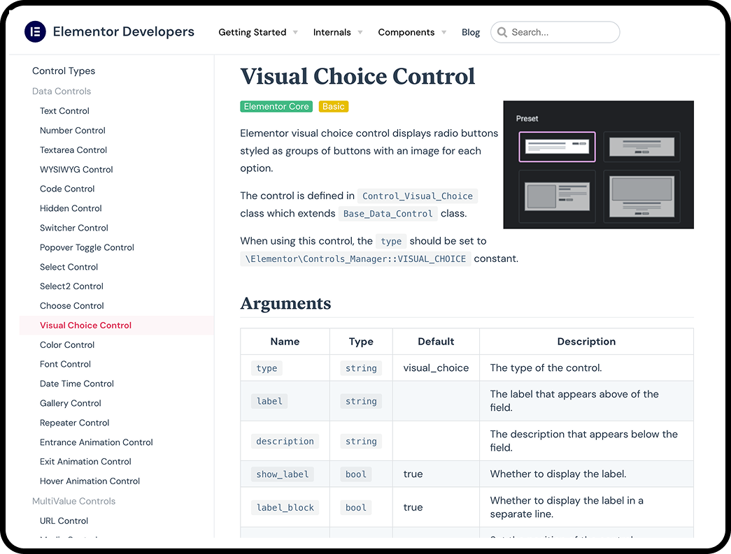
The new control was adopted into Elementor Core
Product | Hello+ WordPress plugin → Adopted into Elementor
Role | Product designer
Responsibilities | Research, design, dev collab and handover
Length | ~2 months
Team | Themes, including PM and devs
Year | 2025
Role | Product designer
Responsibilities | Research, design, dev collab and handover
Length | ~2 months
Team | Themes, including PM and devs
Year | 2025
Background
A bit about Elementor and Hello+
Challenge
Reduce customization friction to drive product activation
Project context
Design a new feature for the Hello+ WordPress plugin, a complimentary addon to Elementor and the Hello themes.
Hello+ plugin business goal
To streamline onboarding for new users, reduce the learning curve, and increase activation, thereby driving them toward the Elementor Pro upgrade.
The paradox of customization
While Elementor widgets offer nearly endless customization, this flexibility creates friction for new users.
While Elementor widgets offer nearly endless customization, this flexibility creates friction for new users.
The complexity of building with single-element widgets negatively affects activation.
Hello+ widgets solved this to a certain degree by offering purpose-built widgets with a predefined base layout that can be customized to some extent.
Hello+ widgets with starter layouts
However, we identified key friction points that still slowed down new users and led to decision fatigue:
⬥ Lack of clarity
The widget potential was not obvious from the start; users could not easily determine what layouts the widget was capable of creating.
⬥ Time consumption
To achieve a different desired layout, controls needed to be adjusted one by one. This process was time-consuming and ultimately led to decision fatigue when users attempted to understand the basic layout possibilities.
⬥ Limited scope
The controls were limited because they were configured in relation to each other, rather than representing comprehensive layout options.
Project goals
The project was initiated to address these friction points, and ensure that the Hello+ widgets met their objective of helping new users get started faster. Our goals were to ensure the solution achieved the following:
⬥ Clarity
Make the widget potential clear from the start.
⬥ Efficiency
Speed up and simplify customization while balancing this simplicity with the existing need for flexibility.
⬥ Guidance
Guide users by offering layouts that followed best practices.
⬥ Integrity
Keep the user's content intact when switching between different layouts.
Process
Strategic decisions and navigating technical constraints
The solution was defined by synthesizing competitor research and navigating rigid technical constraints within the Elementor ecosystem. The process focused on finding a scalable, visual control system that could simultaneously simplify configuration for new users and maintain full customization for experienced users.
Phase 1: Research, constraints, and the critical pivot
My initial discovery involved competitive research into popular website builders, analyzing how platforms like Wix, Webflow, Shopify, and Squarespace handled features similar to widget presets and visual previews.
My initial discovery involved competitive research into popular website builders, analyzing how platforms like Wix, Webflow, Shopify, and Squarespace handled features similar to widget presets and visual previews.
This research provided insight into what was effective and what wasn't. This helped me shape an early idea of how the presets feature would look and behave.
Competitor preset naming examples
I then reviewed the existing Hello+ widgets to determine which Hello+ widgets would benefit from presets, and the most common layouts needed for each Elementor widget type.
Two parts to designing widget presets
1. Design preset layouts
2. Design and define widget preset controls
1. Design preset layouts
2. Design and define widget preset controls
#1Preset layout components
We'll focus on #2 (preset controls)
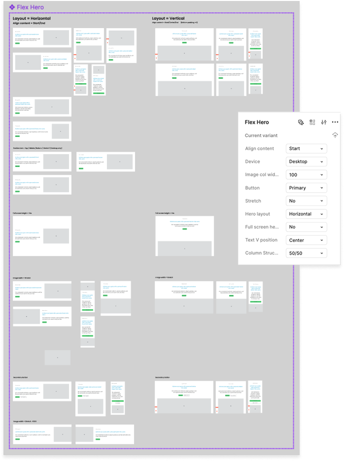
I started with the widgets that most needed extra flexibility
Initial widgets to add presets
However, the primary challenge shifted from design to technical implementation and backward compatibility.
Constraints
Backward compatibility
Any presets added to existing widgets needed to ensure all previous user-created layouts were not compromised. This meant keeping all existing granular controls available, even if the new preset dictated the layout.
Any presets added to existing widgets needed to ensure all previous user-created layouts were not compromised. This meant keeping all existing granular controls available, even if the new preset dictated the layout.
In addition, each new layout should follow similar patterns to keep a consistent look and feel for the widget.
Existing control infrastructure
In addition, I was limited (in the beginning) to existing Elementor controls, so I could not use a visual for first version.
In addition, I was limited (in the beginning) to existing Elementor controls, so I could not use a visual for first version.
Roadblock
The Hero widget required too many changes to meet this backward compatibility rule. Rather than spend too much time overcomplicating the design, I approached the development team about finding a technical solution.
The Hero widget required too many changes to meet this backward compatibility rule. Rather than spend too much time overcomplicating the design, I approached the development team about finding a technical solution.
Solution
Instead of forcing a complicated integration, they suggested developing a new widget, Flex Hero, which would be built for presets from the start, and the existing Hero widget would be deprecated.
Instead of forcing a complicated integration, they suggested developing a new widget, Flex Hero, which would be built for presets from the start, and the existing Hero widget would be deprecated.
This decision was a necessary trade-off that allowed the new preset feature to be fully optimized without being restricted by legacy technical debt.
Phase 2: Design trade-offs and prioritizing user clarity
Next, we needed to decide where to place the new preset control to achieve the greatest impact.
Iteration #1
Content vs. Style tab trade-off
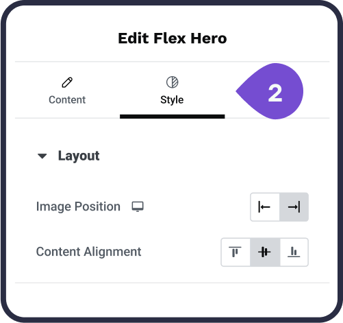
The decision involved choosing whether to place the new control either in the Style tab or the Content tab.
The decision involved choosing whether to place the new control either in the Style tab or the Content tab.
1. Place Preset in Style tab
2. Couldn’t show a visual preset → Added a note about its value
2. Couldn’t show a visual preset → Added a note about its value
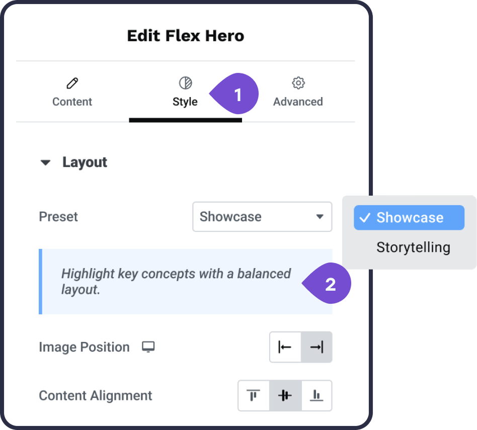
Iteration #1
-------
Iteration #2
User goal
The control needed to be the first thing the user sees when opening the widget.
The control needed to be the first thing the user sees when opening the widget.
Problem solved
Placing it early addresses the core problem: making the widget potential clear from the start.
Placing it early addresses the core problem: making the widget potential clear from the start.
Logic
Although the preset affected styling, the layout fundamentally defines the content structure; users need to select a structure before diving into granular styling details.
Although the preset affected styling, the layout fundamentally defines the content structure; users need to select a structure before diving into granular styling details.
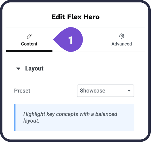
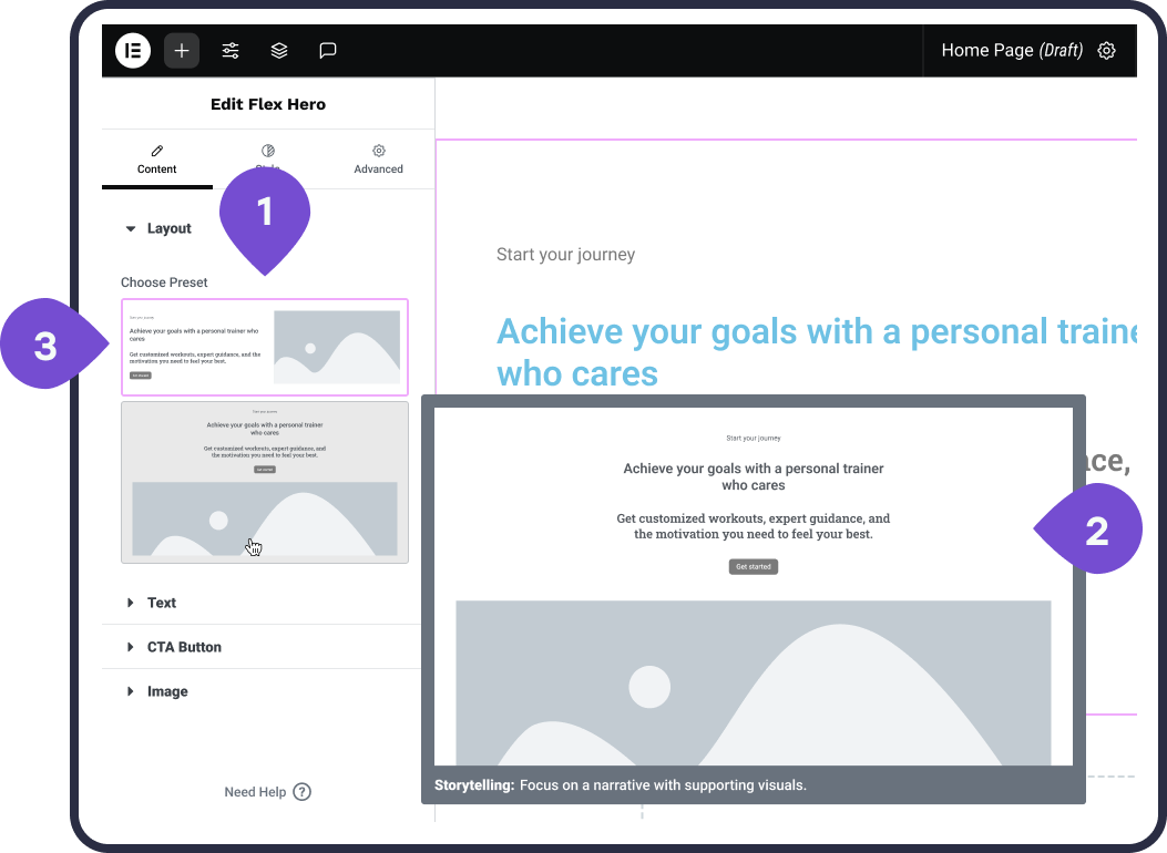
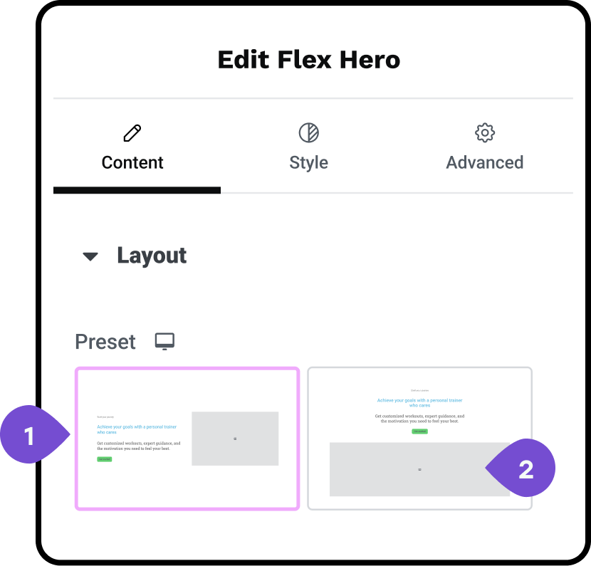
Outcome
We moved the preset control to the Content tab. This decision prioritized making the widget's potential immediately visible to the user, thereby fulfilling the project goal of reducing the learning curve.
We moved the preset control to the Content tab. This decision prioritized making the widget's potential immediately visible to the user, thereby fulfilling the project goal of reducing the learning curve.
We decided to keep the more granular controls in the Style tab for advanced customization. This first version was released successfully in the Flex Hero widget, validating the function and proving the concept.
Iteration #2
-------
Phase 3: Iterating towards a visual solution
Iteration #3
After the proof of concept, the next step was to evolve the control from text-only definitions to a compelling visual choice.
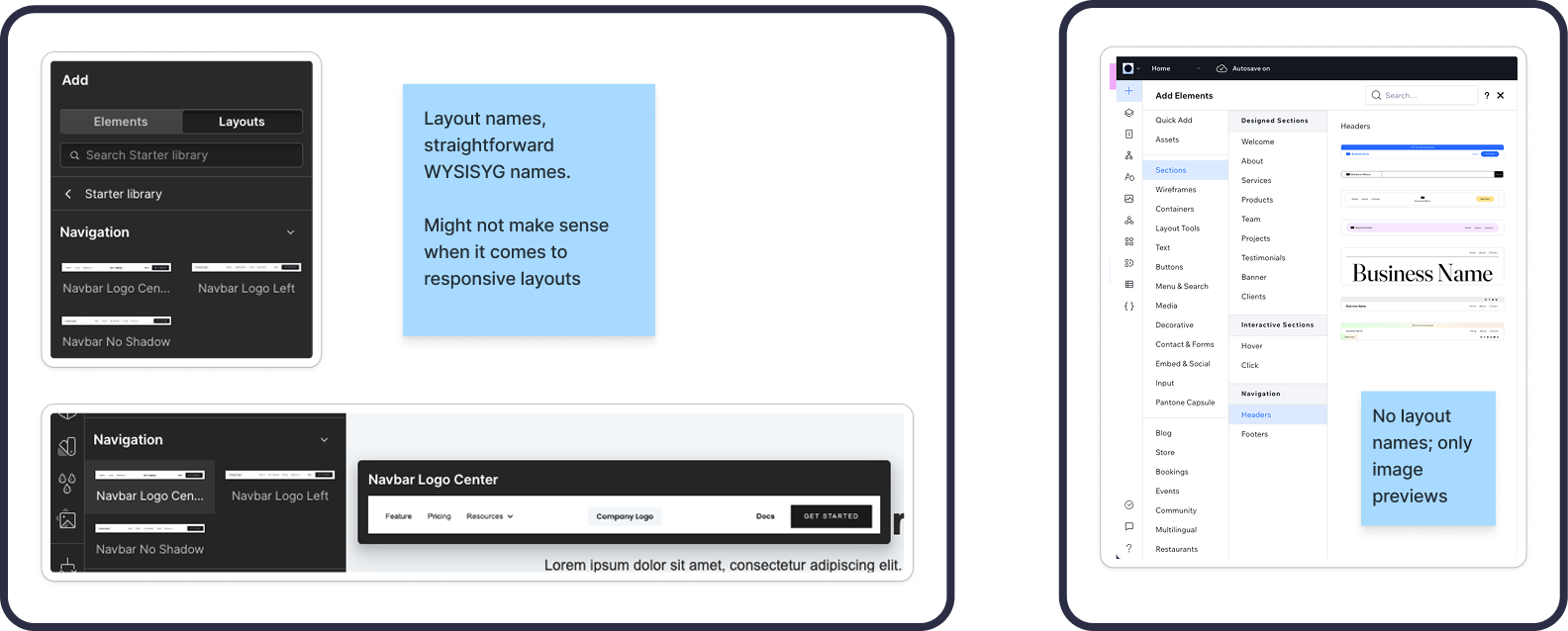
Because we were initially limited to using existing Elementor controls, we leveraged the existing "choose control" interface (previously only used for icon-sized SVGs), but adapted it for larger thumbnail use.
Existing Elementor “choose control”
I iterated through several visual designs, balancing clarity with real-estate constraints
Initial visual design
1. Thumbnails: full-width, medium fidelity wireframe, that displays placeholder text and image
1. Thumbnails: full-width, medium fidelity wireframe, that displays placeholder text and image
2. Large preview: on hover with a tooltip in preview
3. Highlight: for focus state
The Scroll/technical constraint
⬥ Trade-off 1 (Thumbnail Size): Full-width thumbnails were quickly rejected because they required excessive scrolling when multiple preset layouts were available.
⬥ Trade-off 1 (Thumbnail Size): Full-width thumbnails were quickly rejected because they required excessive scrolling when multiple preset layouts were available.
⬥ Trade-off 2 (Hover Preview): Devs encountered a blocker displaying the hover preview above the canvas, forcing us to temporarily put this feature on hold
-------
Iteration #4
Design refinement
1. Shifted to smaller thumbnails (2/row), ensuring all available presets were visible at a glance without scrolling.
1. Shifted to smaller thumbnails (2/row), ensuring all available presets were visible at a glance without scrolling.
2. Simplified the thumbnail designs and added color
-------
Iteration #5
I simplified the thumbnail visuals further by reverting to greyscale and sharpening the previews for quick recognition.
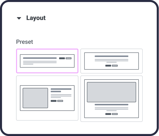
This iteration phase successfully resulted in the final Hello+ widget presets control, which established a visual, one-click mechanism for swapping layouts while preserving user content.
The process required flexibility and compromise, and demonstrates ability to navigate limitations while retaining the core user benefit.
This core control was later adopted by DevEx into Elementor Core, demonstrating the solution's strategic value and scalability.
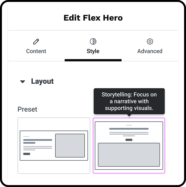
Final Hello widget presets control
Outcome
Proving value and scaling the solution
The new visual presets system achieved the initial project goals of reducing friction and clarifying widget potential, leading to qualitative success and, most importantly, the strategic adoption of the control into Elementor Core.
Quantifiable impact and business metrics
To address the initial problem of time-consuming configuration and user drop-off, the implementation of the presets delivered significant improvements. Although specific financial metrics were not available, we focused on user behavioral metrics and strategic product adoption to measure success.
To address the initial problem of time-consuming configuration and user drop-off, the implementation of the presets delivered significant improvements. Although specific financial metrics were not available, we focused on user behavioral metrics and strategic product adoption to measure success.
✦ Activation and efficiency (estimated)
Based on internal testing, the one-click nature of the new control system is estimated to have achieved a 40% reduction in user drop-off during initial widget configuration. The ability to swap in one click meant users could establish complex layouts much faster than adjusting controls one by one.
✦ Scalability success
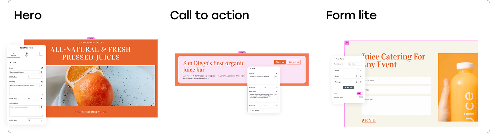
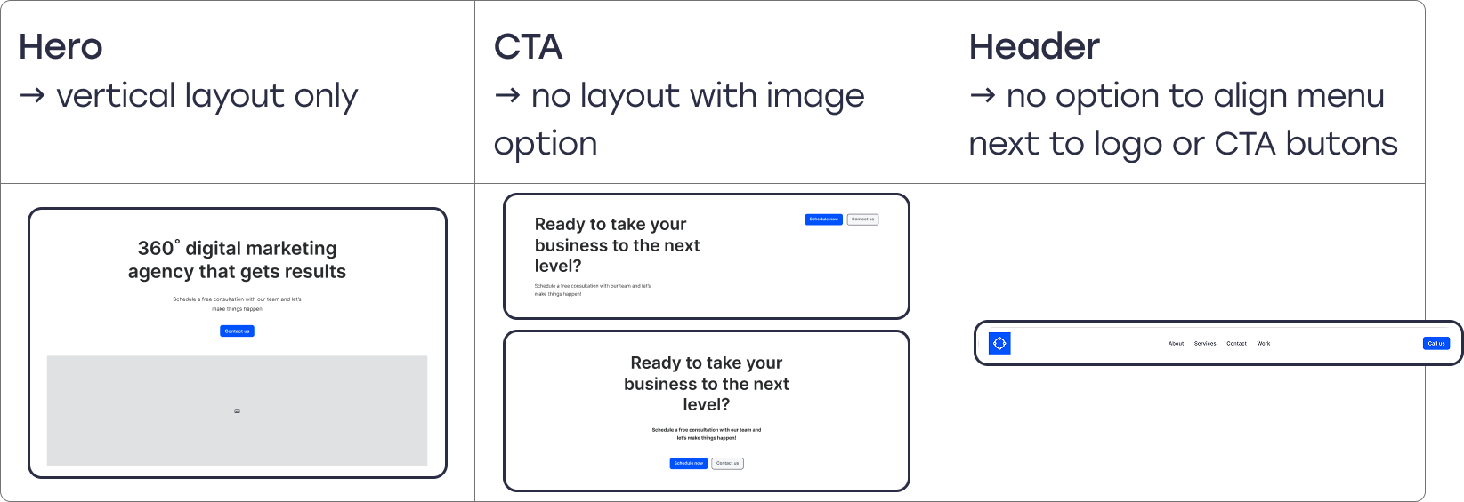
The new visual control was successfully implemented in six key Hello+ widgets (Header, Footer, Flex Hero, Contact, CTA, and Form lite).
In phase II, I created a secondary column structure preset control in Style, based on similar principals as the preset layouts.
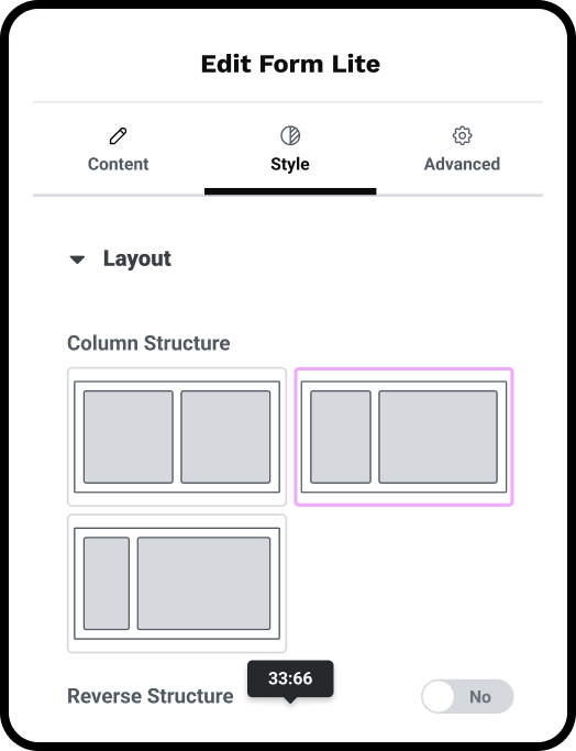
Column structure preset control
-------
✦ Core Adoption
The design system we created for the presets was recognized by the DevEx lead and subsequently adopted control into Elementor core, proving its long-term strategic value and scalability across the entire Elementor platform.
The design system we created for the presets was recognized by the DevEx lead and subsequently adopted control into Elementor core, proving its long-term strategic value and scalability across the entire Elementor platform.
Qualitative results and social proof
The qualitative benefits confirmed the design solved the user's primary pain points
✦ Visual Clarity
Users gained a visual choice, allowing them to see all available presets from the start and quickly understand the clear potential of the widget capabilities.
Users gained a visual choice, allowing them to see all available presets from the start and quickly understand the clear potential of the widget capabilities.
✦ Data Preservation
The ability to preserve work ensures users don’t lose information between swaps, addressing a critical pain point around content integrity.
The ability to preserve work ensures users don’t lose information between swaps, addressing a critical pain point around content integrity.
This impact was reinforced by direct feedback from collaborators, serving as powerful social proof that builds trust:
“I would like to work with you more closely; you really know what our users need.”
– DevEx lead
Reflection and Continuous Growth
Key Learnings
This project reinforced several critical principles that demonstrate navigating real-world barriers:
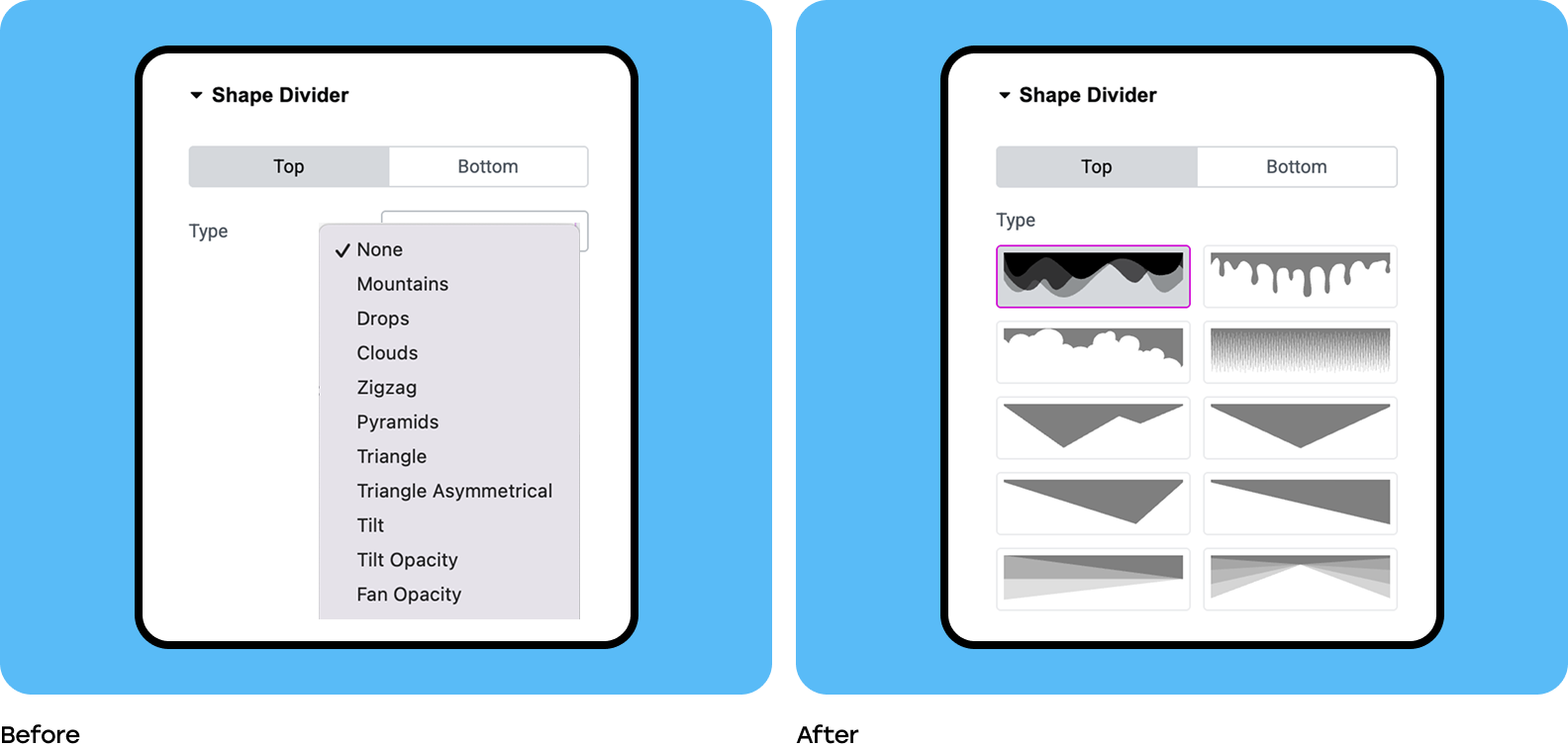
✦ Advocating for visuals
We successfully advocated for adapting an existing Elementor "choose control" interface to accommodate larger, more complex visual thumbnails. This demonstrated how to leverage existing tools creatively to achieve a desired UX outcome.
✦ Constraint-driven innovation
The technical impossibility of making the Hero widget backward-compatible became an opportunity to prove the feature's value by creating the dedicated Flex Hero widget built for the presets structure from day one.
The technical impossibility of making the Hero widget backward-compatible became an opportunity to prove the feature's value by creating the dedicated Flex Hero widget built for the presets structure from day one.
What I would do differently
If given more time or resources, reflection involves critically assessing trade-offs and decisions:
✦ Dedicated A/B Testing
I would have allocated resources to A/B test the finalized thumbnail size and visual clarity. During the iteration phase, there was an ongoing discussion about the thumbnails not being "sharp" and the color potentially being distracting/confusing, which requires data to definitively resolve.
✦ Pushing the vision
I would have invested more time in securing the technical resources necessary to deliver the hover preview feature earlier in the process. Although it was put on hold due to a technical blocker, a working large preview would have enhanced the user experience significantly.